Lundy Stamps - 175 Puffins

The highest value pair of stamps give prominence to the Lundy Field Society founders - Martin Coles Harman who was president between 1946 & 1954, and Leslie A Harvey, secretary from 1946 to 1959. Running behind these portraits across both stamps is the landscape looking North towards Old Light, where the Field Society made their headquarters for many of the early years. This vista was already very familiar to me as back in 2015 I had sat in that landscape and made a watercolour & ink painting in my sketchbook.

Watercolour and ink sketchbook painting, made in situ during April 2015

Watercolour and ink sketchbook painting, made in situ during April 2015

Although this view is often dotted with sheep from Lundy’s farm, Lars asked for me to include just Soay sheep in this artwork. Soay, originating in St. Kilda and the most primitive domestic sheep in Europe, were introduced to Lundy in 1942 by Martin Coles Harman. In reality the population live further up the island, North of quarter wall, but for creative purposes I moved them south of Old Light.

L to R: My daughter tending an orphaned Soay lamb in 2016; a few of my sketches using my own photographs as source material

L to R: My daughter tending an orphaned Soay lamb in 2016; a few of my sketches using my own photographs as source material

I draw a lot of portraits, preferably from life, but also from photographs, and since March 2020 live online. For making a likeness of Harvey I only had one sketch by artist John Dyke available to work from. I was asked to portray Harvey at more of a 3/4 viewpoint than this sketch and minus the pipe!

L to R: Dyke’s Sketch of Leslie A Harvey; 3 of my pencil sketches; drawing in sepia ink made with brush and dip pen

L to R: Dyke’s Sketch of Leslie A Harvey; 3 of my pencil sketches; drawing in sepia ink made with brush and dip pen

A small number of photographs exist of Harman, and I was immediately drawn to him as an older man, complete with double chin and wonderful bushy eyebrows! The aim however was to show him as he would have looked when the Field Society was founded, so I reverted to images of him as a much younger man. I made both the final portraits using sepia ink and drawing with a dip pen over diluted ink washes. In the end the ink was too bright so I used photoshop to tone down the colour on the digital files.

L to R: A stamp already featuring Martin Coles Martin;  3 sketches of him at different ages; final drawing in sepia ink made with brush and dip pen

L to R: A stamp already featuring Martin Coles Martin; 3 sketches of him at different ages; final drawing in sepia ink made with brush and dip pen

Although composed in black and white as one image, I quickly decided to paint the 2 portraits and the landscape separately and put them together in Adobe Indesign. The main reason was that I wanted to paint the landscape uninhibited, using broad strokes of watercolour paint across the whole page, but working this way also enabled me to tweak the size and position of the portrait ovals as well as adding a defined, even line around each.

Final design in black and white

Final design in black and white

Details from the landscape painting

Details from the landscape painting

All the individual elements back together again in the final design

All the individual elements back together again in the final design

Lundy Stamps - 90 Puffins

Over the next two stamps, the middle value pair, I was asked to depict an underwater scene. These were the pair of stamps Lars was most concerned about as neither of us had any specialised underwater experience to draw from. I had zero visual references of my own, and was totally reliant on supplied imagery and feedback from the experts. Lundy Field Society publication ‘Protecting Lundy’s marine life: 40 years of science and conservation’ became my bible over the duration of producing this artwork.

I was very grateful to Alan Rowland sending me this book with directions!

I was very grateful to Alan Rowland sending me this book with directions!

As is often the case, rather than being fraught with problems this artwork ended up being the most straight forward. Perhaps because although I had a list of important elements to incorporate, I was allowed more freedom to compose them within the space. Unlike the other two pairs, both with recognisable landscapes, here my only restrictions were to show two seals on the left hand stamp and a diver on the right. I was able to make these characters large and the main focus of the design.

Preliminary sketches of divers

Preliminary sketches of divers

There was discussion between the various experts expressing concern about showing a diver reaching out to a young seal as this is discouraged, but the gap created by the perforations separating the two was deemed sufficient. I spent a lot of time ensuring each stamp worked individually as well as part of a pair, but that did mean thinking about 3 composition at once!

The final design in monochrome
The final design in monochrome

I was keen to keep the colours fresh to help keep the individual elements clearly legible at such a small size, but when it came to making the painting in colour I did go a bit ‘Mediterranean’ with the water, and had to tone it down in Photoshop at a later stage.

Details from the painting with its ‘Mediterranean’ sea!

Details from the painting with its ‘Mediterranean’ sea!

I used Photoshop to make fine adjustments to the CMYK tiff and was asked by Cartor, the specialist French printers, to provide a file for print that was 1200dpi. By comparison, the standard for print is just 300dpi !!

Final design which I put together in Adobe Indesign ready for print

Final design which I put together in Adobe Indesign ready for print

Lundy Stamps - 65 Puffins

Back in February 2020, I was approached to design and illustrate the 8th May 2021 Lundy Stamp issue. I had just finished a set of paintings featuring the Lundy rental properties, which had been turned into postcards & delivered to the Lundy store ready for the 2020 summer season (who knew), so I was still very much in the Lundy zone and keen to get involved.

Lars Liwendahl, Lundy’s long standing philatelic adviser, was due for a brief stopover in London on his way from Stockholm to Lundy, so at the beginning of March 2020 we grabbed the opportunity to meet in person and discussed the project at length over coffee in Tate Britain. Although I have worked to commission for many years, this was my first foray into designing artwork for stamps.

The brief was to produce a set of six stamps to celebrate the 75th anniversary of the Lundy Field Society. Lars had already worked out that he wanted illustrations to run across the full width of each pair of stamps. This made a tricky job even more complicated as the image had to work as a whole, but also as individual left and right hand sides. The aim of the issue was to showcase activities undertaken by the LFS voluntary group, including research & education of the island’s history, natural history and archaeology, plus the conservation of its wildlife. In a nutshell, stamps are tiny but there was a lot to cram in!

The first pair of stamps featured a panorama taking in Marisco Castle and the entire dramatic coastline looking up the East side of the island. I had recently spent time drawing on the island back in October 2019, but I planned to revisit for this project, to make sketches and take references photos of the specific views required. But then Covid swept in and all plans changed.

photos photocopies.jpg

Supplied photo and photocopies

Instead I found myself digging through my own archive of photos & sketches from previous visits, and Lars was able to supply a number of images gathered from various sources too. Between them all I cobbled together enough information to sketch out the view, albeit with a fair degree of artistic licence in order for the composition to work within its stretched proportions.

The next task was to add people to the scene, all taking part in activities. Photos were helpfully emailed from the island to indicate the size of a figure at various points in the landscape, although I did modify scale slightly to ensure they would be clearly visible once dramatically reduced in size.

Once Lars & I were happy with the composition of the landscape I digitised the pencil sketch and used Adobe Photoshop to arrange figures in the scene. I made numerous individual sketches of people, sometimes asking my family to pose for me. My immediate family all appear in this illustration, although my kids are now 19 & 16 so I referenced photos from when they were much younger! I scanned all these sketches and added each one to a separate Photoshop layer. This enabled me to quickly move, scale and flip, avoiding endless laborious redraws. In the end the file comprised of 43 layers - all variations on a theme!

My computer screen shows my design process and the many Photoshop layers I used to compose the first two stamps

My computer screen shows my design process and the many Photoshop layers I used to compose the first two stamps

The final version in black and white. Spot the difference with the final stamp design!

The final version in black and white. Spot the difference with the final stamp design!

Once the digital composition was finalised I redrew the scene in pencil and emailed it to Lars for approval. Then I started the watercolour. At 57cm wide, the painting was many times larger than the 8.4cm it would eventually end up, so I had to ensure the figures would stand out against the landscape when reduced to only a few millimetres high. I wanted to avoid giving everything a black outline, I device I’d seen used on other stamps, so instead dressed the figures in an array of bright colours in the hope they would show up sufficiently against the natural greens & greys behind. Full colour adds another level of complexity! Lars had initially asked for the sky to be a perfectly summer blue, but I persuaded him to embrace a few clouds. The sky occupies a significant proportion of the page and I wanted to give it a bit of interest. This project was very much a collaboration, and I think Lars and I worked well together, via email and telephone, to get to a point that we and ultimately the client were happy.

Final version of the 65 Puffin pair of stamps (denominations crossed out as requested by Lars.)

Final version of the 65 Puffin pair of stamps (denominations crossed out as requested by Lars.)

Given the repeated lockdowns over the past 14 months, it was extremely handy that I am married to a photographer, specifically one with over 30 years experience photographing works of art. He shot my final illustrations on a Hasselblad camera, giving me superb quality 150mb images to work with. I was able to layout the stamps in Indesign and add the extra high resolution tiff files specified. After transferring print ready PDFs to the specialist printer in France I realised I’d been able to complete the entire job without needing to leave my South London studio!

In my next post - design of the 90 Puffin pair of stamps…
1stdaycover.jpg

Walking and Drawing Project, Winter 2020/21

When on 19th December it was announced that London would be immediately slammed into new tier 4 restrictions broadly equivalent to another lockdown, my heart sank & I knew I needed to devise a plan to keep me motivated during the difficult winter months ahead.

I wanted to combine my love of walking with drawing from observation, activities that each allow my over thinking brain to relax. Where I live in South West London there are numerous green spaces within reasonable walking distance, and it is relatively easy to avoid crowds when the temperature is low, to find a quiet corner to hide in, even in such a densely populated area.

I have always loved walking and the headspace it bestows. I remember back to my teenage years when I needed to escape the claustrophobia of home and would endlessly pound the streets listening to taped albums back to back on my Sony Walkman. Today the choice is wonderfully limitless and I flit between music, podcasts and talking books as I march to and from my chosen destinations. Headphones help to keep my ears warm and at the same time block out distractions that threaten to invade from the wider world.

I had already been making regular drawings of urban trees during the warmer months of 2020, but these had been mainly in monochrome and concentrated on texture and light, ignoring colour almost completely. For this exercise I wanted to delve into colour, and explore the delicate shades of the natural world against the pale neutral backdrop of winter, and convey how subtly glowing hues becoming almost luminous when touched by a low winter sun.

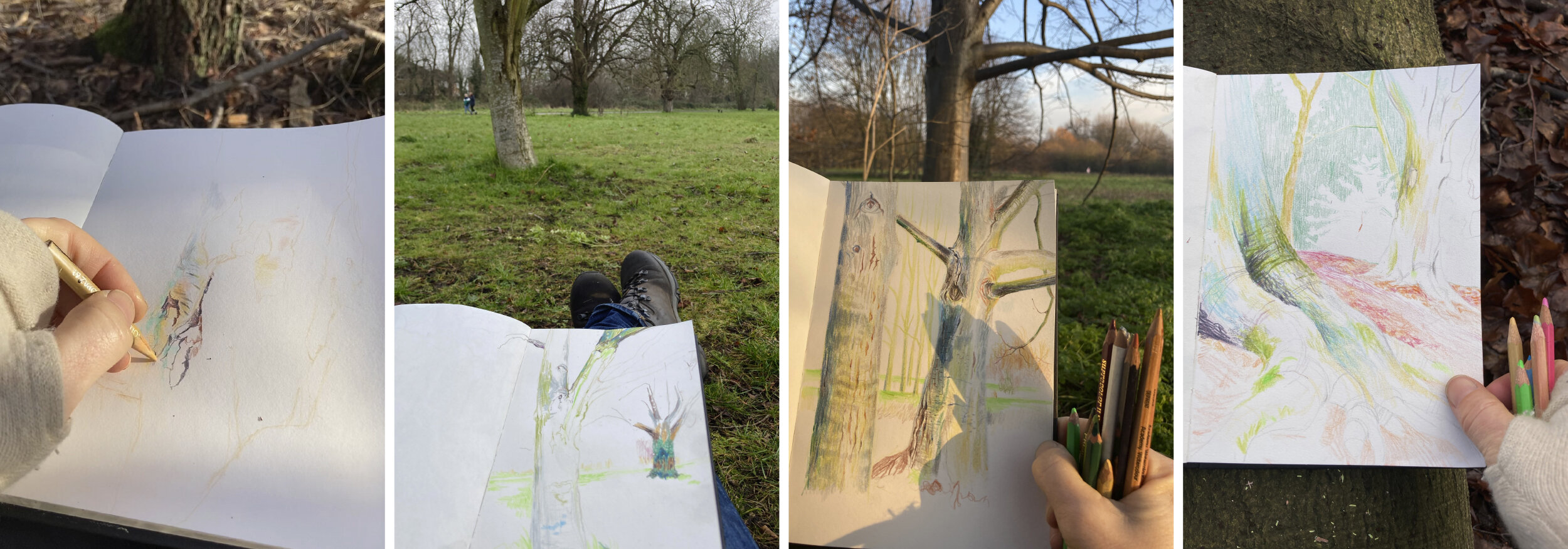
L to R: Drawing in graphite on Wimbledon Common, July 2020; Sketchbook drawing in graphite and pastel, Morden Hall Park, Dec 2020; A3 colour pencil portrait of a pine tree in Morden Hall Park, Dec 2020; A5 colour pencil drawing made of the River Wan…

L to R: Drawing in graphite on Wimbledon Common, July 2020; Sketchbook drawing in graphite and pastel, Morden Hall Park, Dec 2020; A3 colour pencil portrait of a pine tree in Morden Hall Park, Dec 2020; A5 colour pencil drawing made of the River Wandle running through Morden Hall Park, November 2020.

The first three images above were drawings made entirely from observation, but the colour pencil drawing on the right (a tree leaning over the River Wandle), was started in situ and completed back at my studio from memory. I enjoyed building up layers of vivid colour and noticed how pattern began to appear when no longer working from direct observation. I have to fight against my love of excessive detail, and appreciate that working away from the scene allows a new language to emerge.

A selection of A5 colour pencil drawings made in Morden Hall Park during December 2020 & January 2021

A selection of A5 colour pencil drawings made in Morden Hall Park during December 2020 & January 2021

I decided to make a series of tree portraits using November’s River Wandle drawing experience as a starting point. I created a rough list of aims to refer back to as the series progressed:

  • Stick to an A5 portrait format throughout to force myself to vary composition and view point

  • Restrict myself to colour pencils only, build up in layers & explore mark making possibilities

  • Begin from direct observation, but finish from memory

  • Compose each drawing from the start rather than let the scene emerge organically & consider the entire page right to the edges

  • Explore colour, pattern, light and texture in equal measure, never letting one dominate

  • Concentrate on producing colourful uplifting drawings that showcase the abundance of green spaces in my local area

A selection of A5 colour pencil drawings made on Wimbledon Common during December 2020 & January 2021

A selection of A5 colour pencil drawings made on Wimbledon Common during December 2020 & January 2021

It has now been just over 5 weeks since this latest lockdown began and so far I have finished 24 drawings in this series. I have walked many miles, which I know is important for my wellbeing, and am returning repeatedly to explore the same few locations to really get to know them intimately in all weathers. I try to remember to take reference photos, but on the whole I have avoided relying on them once back in my studio. I try not to concern myself with the end result, but focus on being present and recording moments in time. I know I will look back and be able to remember the making of each drawing vividly - the dampness of the earth, the penetrating cold, the uncomfortable uneven ground, but also the peaceful atmosphere, the variety of birdsong, the gradually extended daylight as we move further away from the winter solstice and the individual beauty in each and every tree.

I don’t always remember to take photos on location as I become so absorbed in drawing, but these are a few mid-process phone snaps.

I don’t always remember to take photos on location as I become so absorbed in drawing, but these are a few mid-process phone snaps.

Pamber Forest

I met up with @jobeal4 earlier this week for a walk and draw in an incredibly atmospheric Pamber Forest. At one time this ancient woodland was part of the Royal Forest of Windsor, and a refuge for deer; the royal quarry. Now only a fraction of the 300 year old oaks remain and we didn’t see any deer on our ramble, but we did come across cattle grazing and spotted (and heard) buzzards.

We wandered around exploring for a while, before selecting a spot away from the path and laid Jo’s blanket on a deep, damp carpet of russet coloured leaves to try and make sense of the tangle of sharp, overlapping branches surrounding us. It was beautiful in there, hidden deep amongst the trees, but also weirdly still and a little eerie, so I’m glad I had company.

PF copy.jpg

A fine misty drizzle hung in the air for most of the afternoon, but I only noticed it had been raining when my sketchbook page became damp & warped. Being absorbed in drawing swallows up time at an alarming rate and I don’t know how long we were there but it must have been several hours. We realised that our eyes had adjusted to the diminished light, that it was not long until dark & we had become really quite cold. The lack of sun meant there was no way of telling which way we were facing and so which direction we needed to head. I did feel a slight urgency to find our way out of this cautionary fairytale setting before dark. Although the remaining site is only 844 acres, the paths criss-cross and curve and so it is easy to become disorientated.

We emerged from the cluster of formidable trees onto the soft springy heathland of Silchester Common. The aromatic pines, gnarly silver birches and spiky gorse bushes found here are the backdrop to my childhood. I would cycle endlessly through this terrain after school, feeling a snippet of freedom before heading for home.

It was still just before dusk, so I was able to take Jo on a quick loop of the common to a particularly favourite spot of mine, where the setting sun glows though a majestic pine and shimmers onto the water in front of it. We were lucky that the weak wintery sun did briefly put on a show the moment we arrived. I recently made a drawing of this scene, mainly from memory, so it was a treat to see it in the flesh again so soon after completing my drawing.

PF2.jpg

Drawing in Wiltshire

Back in the summer, during that small window of opportunity when the country began to open up to travel, I donned a mask and boarded a National Express coach to Wiltshire to visit my friend of over 33 years Jo Beal.

Jo & I try to take time out and draw together at least once a year, and these short bursts of intense activity always prove fruitful to our ongoing practise. We reassess our direction through drawing and discussion, and supplement these activities by looking at and being inspired by other artist’s work, visiting exhibitions and watching art documentaries together.

Wiltshire offers a wealth of stunning walks and inspirational drawing locations, and I have always been fascinated by the abundance of ancient myths and legends attached to the county, which invariably weave their way into my drawing.

Wayland’s Smithy

Wayland’s Smithy

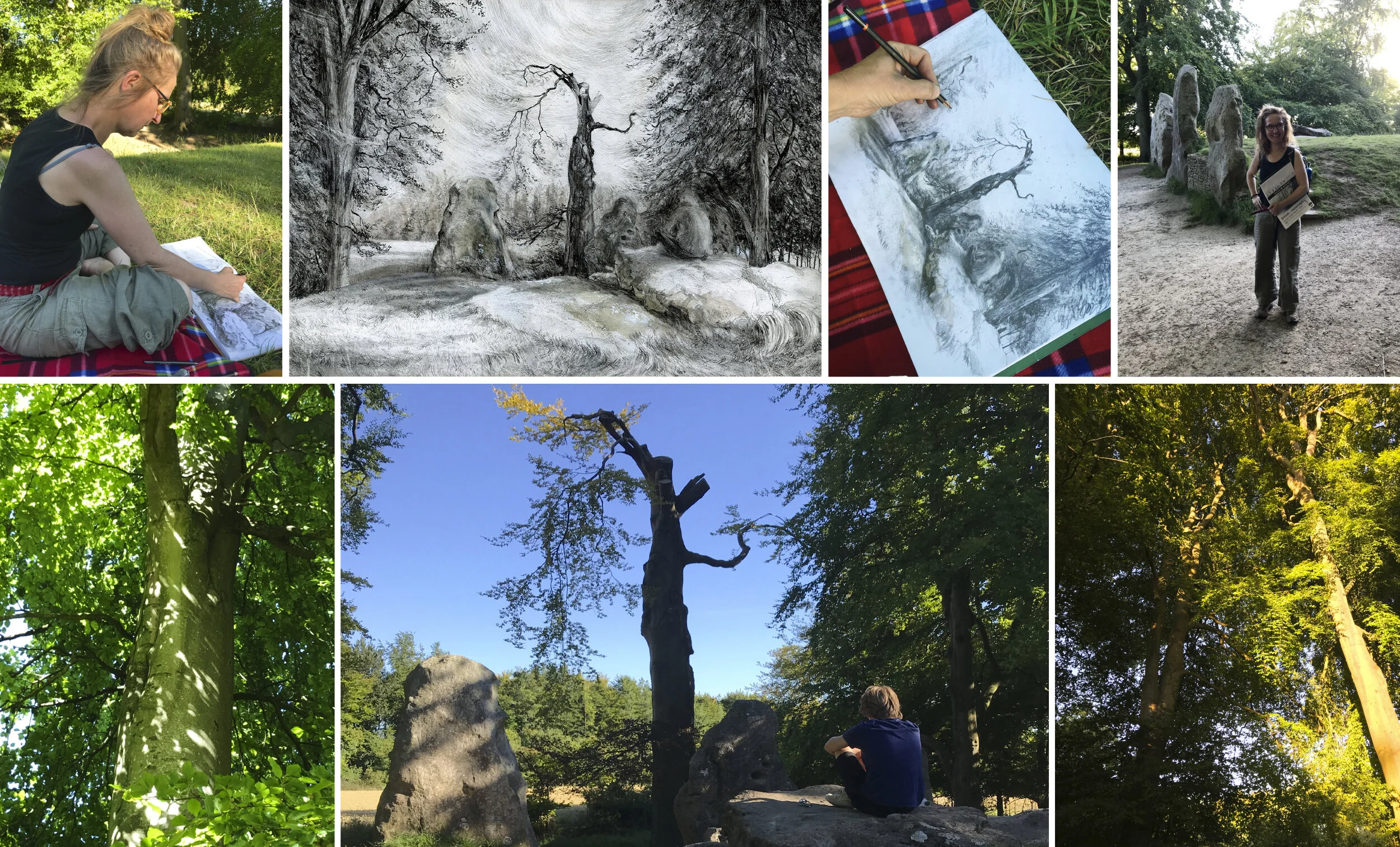
Our first stop was along the Ridgeway to Wayland’s Smithy, a two-phase Neolithic tomb dating back to 3590 BC. Surrounded by huge rustling trees, the whole area had an eerie atmosphere and I wanted to try and portray that slightly unearthly feeling in my drawing. I concentrated on mark making using mainly graphite but with a tiny amount of gouache too.

There is a local tale, that if you were leave your horse tethered to the long barrow, along with a coin, then the Wayland elf would magically re-shoe your horse while you were away.

Our walk down off the Ridgeway at the end of day one. It ended up being a race to get back to the car before dark.

Our walk down off the Ridgeway at the end of day one. It ended up being a race to get back to the car before dark.

The following morning was sweltering hot, and in order to avoid the midday sun’s burning rays we explored the shady depths of Savernake Forest. Initially I was keen to draw ‘Big Belly Oak’ the oldest oak tree in the country at an incredible 1125 years old, a sapling while Alfred the Great was King. But unfortunately this magnificent beast, now held together with a huge metal collar, grows right next to the busy A346 & I didn’t fancy parking myself adjacent to melting asphalt and being disturbed by an endless stream of traffic thundering part. Instead we walked much further into the forest and settled for a much quieter and far more secluded location, hidden amongst bracken under a canopy of leaves.

From Norman times the forest became a royal hunting ground, and so I decided to include an imagined stag into my drawing, whose antlers perfectly echoed the mass of overlapping, twisted branches that I was attempting to make sense of.

Savernake Forest

Savernake Forest

The following morning, another beautiful albeit not quite so unbearably scorching one, we drove to Jones’s Mill. In advance we had decided to draw with just ink and to apply it with an array of natural mark making materials, including feathers, twigs of various sizes, sponges and cocktail sticks. Between us we had black, white, sepia, umber, blue/grey & yellow to work with. We sat on a blanket in the middle of the Nature Reserve and responded to the continual changes to the scene in front of us - a recurrent motion caused by a gentle breeze stirring the leaves, the graceful swirling of a flock of starlings dancing above the treetops and a buzzard hastily overlaid with a red kite, both of whom swooped into my eye line over the course of the afternoon.

Jones’s Mill Nature Reserve

Jones’s Mill Nature Reserve

Our final day was spent basking in the sunshine high up on Markham Banks, looking over Clouts Wood with Swindon beyond, far into the distance. It was a perfect hot summer’s day, with welcome shade provided intermittently by sedately moving clouds. As soon as the blanket had been laid out on the long grass, we were joined by a couple of curious grasshoppers, who sat comfortably with us and posed for photographs.

We drew what was in front of us using our limited collection of inks and natural mark making materials again, and tried to build on what we had learned from the previous day.

Until next time….

Clouts Wood including Markham Banks, Kings Farm Wood and Diocese Meadows

Clouts Wood including Markham Banks, Kings Farm Wood and Diocese Meadows

View from the Flat Roof

For the first 30 days of lockdown we enjoyed clear blue skies and wall to wall sunshine in London. Whilst I have been appreciating my south facing garden more than ever, I have also been making use of the flat roof that over looks it. For the best part of 2 weeks, for an hour or two at a time (it gets hot up there) I’ve sat up on the roof and drawn the view. Access unfortunately is via an un-elegant climb through my daughter’s bedroom window, a difficult journey that also involves tip toeing delicately across a floor strewn with the detritus of her own creative endeavours - fabric off cuts, tangled threads, squeezed paint tubes and piled canvases, and always a precariously balanced laptop permanently running Netflix.

I started my drawing in an A3 pad, getting down what I could see directly in front of me with no plan. Gradually the drawing grew, as sitting on the roof in the warm sunshine felt like a kind of freedom and I needed a reason to stay. The drawing extended outwards, extra A3 sheets glued on as I needed them, until I ended up with a 148cm long piece encompassing the complete 180 degree view around me. I found myself totally absorbed in carefully observing every tree branch and chimney pot, fence panel and shrub. I witnessed the blooming of the cherry blossom in next door’s garden, then watched when the tiny petals blow off & scattered like confetti, sharply followed by the sudden explosion of new bright green leaves. I tracked the movement of the birds, sparrows nipping from shrub to shrub collecting nest building material, blackbirds hopping across the lawn and the sporadic visit from a heron swooping overhead. I listened to the chorus of calls, no longer drowned out by passing traffic and power tools, the individual chatter of crows, sparrows, robins, tits, finches, and in particular the wood pigeons - a comforting sound that takes me straight back to my early childhood.

Photos from the 1970s, when I was happy to be amongst the pine trees

Photos from the 1970s, when I was happy to be amongst the pine trees

I grew up in a place surrounded by the sweet smell of pine trees and the incessant coo of wood pigeons, but juxtaposed by miles and miles of barbed wire fencing. A no-mans land on the Hampshire/Berkshire border, it was (and still is) a place neither urban nor rural, but ugly and sprawling, mainly made up of prefab 1950s housing stock butted up against the impenetrable barrier surrounding the MOD Atomic Weapons Research Establishment. I was quite happy living there as a young child, but was unaware of the warhead design and manufacture taking place on the other side of the wire. There was no ignoring it as I grew up though, especially once the women’s peace camp formed outside nearby Greenham Common Air Base in the early 1980s. I rode on the actual common every weekend, and briefly chatted to some of the women as I passed. On those rides I was also confronted by heavily armed, stoney faced American soldiers, standing at regular intervals guarding the cruise missiles stored in bunkers on the other side of the fence. Men, a symbol of power and control on the inside, women and children representing peace on the outside.

I felt trapped and suffocated as a teenager, this place was my home yet I was opposed to the development of nuclear weapons and uncomfortable being part of the community. To me it was also a cultural backwater where my life remained on pause, waiting the opportunity to leave. I am relating to that feeling now, trapped at home by Covid-19, life again on hold. It’s bizarre to find myself in a similar head space 30 odd years later, but escaping into drawing, making and daydreaming helped me enormously then, and it is my mental escape route again now.

The finished drawing, graphite and pen on paper, 148 x 30cm, with details below

The finished drawing, graphite and pen on paper, 148 x 30cm, with details below


Lundy Residency

Last month I had the privilege to be invited by The Landmark Trust to spend a week drawing and painting on Lundy Island. I have been commissioned to make a series of paintings of all the rental properties available on the island with the aim to produce postcards and prints ready to sell in the spring. What a fantastic opportunity! I spent time making multiple sketches around the village and taking photographs in preparation for work to begin back in my studio. I also spent a considerable amount of time perched on cliff edges drawing the amazing rock formations below. This was my fifth visit to the island and although I’ve drawn extensively on each visit, this was my first time alone, with the freedom to draw from sunrise to sunset … and beyond!

Lundy rocks.jpg

During this particular visit it was the ever changing light and weather over the sea that really inspired me. These were magnificent skies that dominated the landscape with colour and shadow. I watched throughout the day as storm clouds formed and gathered, and drew furiously as rain fell out to sea whilst the low sun made pools of intense light on neighbouring patches of inky water.

Lundy skies.jpg

I stayed in Castle Keep East, a cosy and extremely comfortable cottage that has a ready made mini studio located on a raised platform within the lounge space. I enjoyed the wonderful view from my tiny castle window & made a quick sketch each morning at sunrise looking out across the Bristol channel towards the mainland. Once the sun had set early each evening, I sat at my desk and drew from the sketches I’d made that day including a drawing on one small zinc plate with a hard ground ready prepared.

CKE.jpg

I have been back in London for six weeks now and am still reflecting on this wonderful experience. Lundy is a unique place allows escape from the modern, fast-paced world and gives time and space to think and to reconnect with nature. I am now getting on well with the work I was specifically asked to produce and so far ahead of deadline!

Drawing Development programme

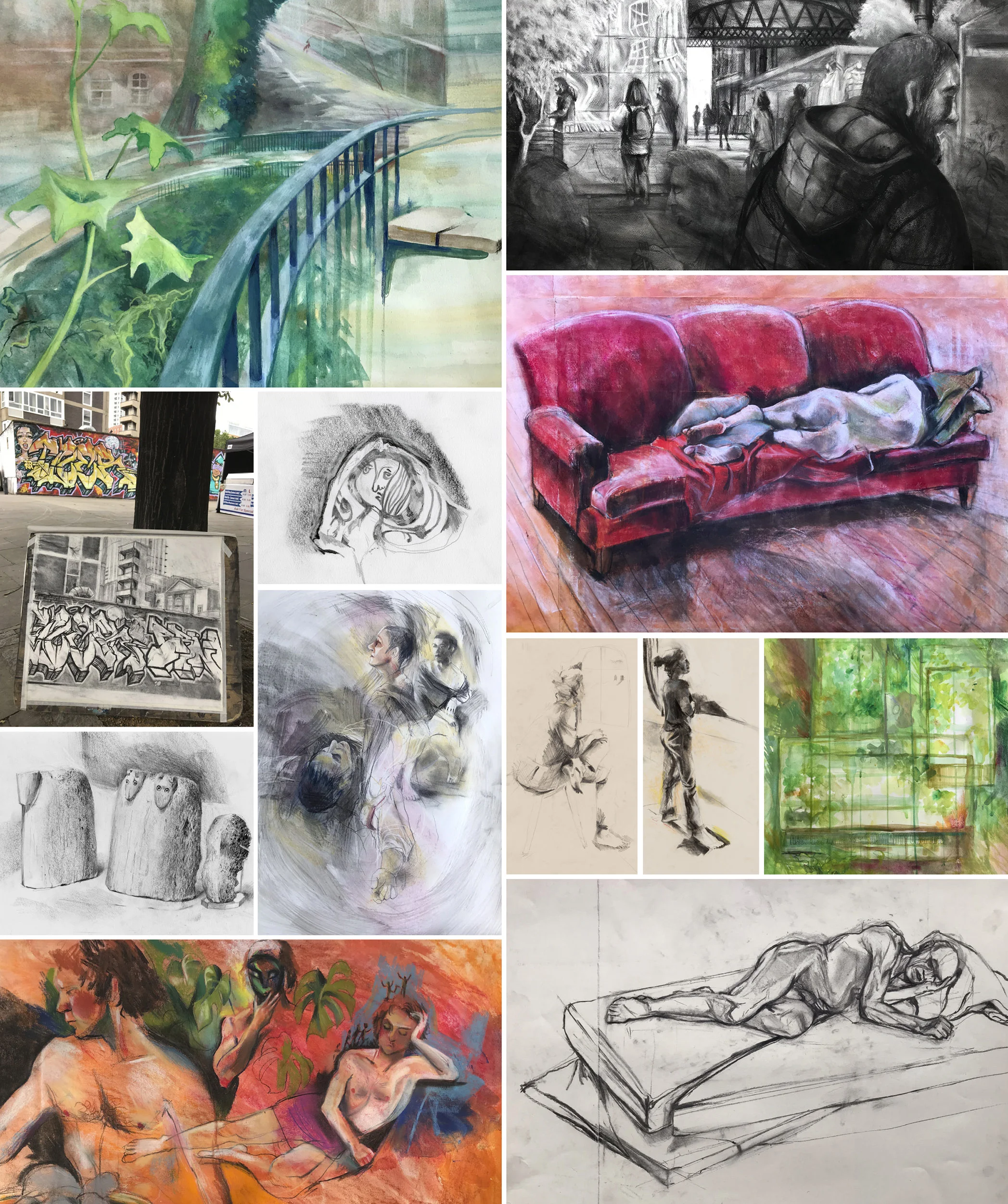
I have been working to commission, of one sort or another, for as long as I can remember, so at the beginning of this year decided I needed to spend an extended period of time experimenting and exploring the direction of my personal work. As part of this phase I joined the 10 week Drawing Development programme at the Royal Drawing School, comprising of four full days and one evening a week of tutored classes, plus tutorials, mentoring sessions and a three hour long group crit in the final week. My self curated week, including drop-classes, comprised of ‘Local Landscape’, ‘Drawing a Story’, ‘Drawing at the British Museum’, ‘Drawing at the National Gallery and ‘Life Drawing’. Each class was run by more than one tutor, and the wide variety of differing opinions and suggestions were immensely beneficial to me, if not confusing and frustrating at times! It was a brilliant and intense term of frenzied activity where I felt free to play and produce a ton of drawings without the pressure to complete a ‘finished’ piece. I also loved being part of the school and working along side such a dynamic group of artists. My approach has definitely altered since undertaking the course, I am more confident in my direction. I’m certainly excited by what comes next. I would absolutely recommend this term to anyone feeling a bit stuck in a rut and looking to further their own drawing.

A small sample of the drawings I made on the Drawing Development programme.

A small sample of the drawings I made on the Drawing Development programme.

Pewsey Vale, Wiltshire

Last week I spent a wonderful few days walking and drawing around a very sunny Wiltshire with artist Jo Beal. On one of the days we sat up looking over Pewsey Vale and made repeated sketches of the magnificent vista stretching away for miles in front of us. Autumn colours were starting to pop up amongst the intricate mapping of fields and boundaries and I spent a lot of time thinking about how to convey the distance created by so many layers of undulating landscape. We were so concentrated on the view, that it was a total surprise to suddenly realise that half a dozen cows had crept up and laid down just behind us. Who knows if we were invading their usual spot, or they were just curious and wanted the company, but they stayed still patiently watching us as we grabbed the opportunity to turn our attention, and pencils, to them instead.

wiltshire Aug2019.jpg


Ireland

I recently spent a week drawing and painting in the South West of Ireland. This was my fourth visit to the area and I decided to limit my materials to an A5 sketchbook, plus a small selection of pencils and a tiny watercolour set with a single travel brush. Travelling light like this opened up opportunities for walking long distances and I was able to access some remote areas with wonderful vistas. In this part of the world the clouds scud continuously across the sky creating wonderful patterns of light and shadow over the hills. I made repeated pencil sketches and quick colour studies attempting to capture the movement of light. The skies here are enormous and the weather can dramatically change within minutes, and back again, so there is no time to get too involved in one painting. The hedgerows are intense with colour at this time of year and sparkle brightly in both in the sun and rain. I found this a liberating exercise and a good way to explore with a view to returning with my full kit!

Ballinskelligs2019.jpg